백엔드 공부할 때 어느정도 화면을 정리할 때 부트스트랩을 사용하면 편할 듯 하다. 기능 대충 보고 document참고하는게 좋을듯.
페이지 안의 사진들은 instructor가 다 제공해줌. 아이콘이나 폰트만 가져와서 사용.
각 구획마다 따로 설명.
Title, Features, Testimonials + Press, Pricing, Call to Action + Footer로 나눠 설명
<헤더>
<head>
  <meta charset="utf-8">
  <title>TinDog</title>

  <!-- boot strap -->
  <link href="https://cdn.jsdelivr.net/npm/bootstrap@5.0.0-alpha3/dist/css/bootstrap.min.css" rel="stylesheet"
    integrity="sha384-CuOF+2SnTUfTwSZjCXf01h7uYhfOBuxIhGKPbfEJ3+FqH/s6cIFN9bGr1HmAg4fQ" crossorigin="anonymous">
  <script src="https://cdn.jsdelivr.net/npm/bootstrap@5.0.0-alpha3/dist/js/bootstrap.bundle.min.js"
    integrity="sha384-popRpmFF9JQgExhfw5tZT4I9/CI5e2QcuUZPOVXb1m7qUmeR2b50u+YFEYe1wgzy"
    crossorigin="anonymous"></script>

  <!-- google font -->
  <link rel="preconnect" href="https://fonts.gstatic.com">
  <link href="https://fonts.googleapis.com/css2?family=Montserrat:ital,wght@0,100;0,200;0,300;0,400;0,500;0,600;0,700;0,800;0,900;1,100;1,200;1,300;1,400;1,500;1,600;1,700;1,800;1,900&family=Ubuntu:ital,wght@0,300;0,400;0,500;0,700;1,300;1,400;1,500;1,700&display=swap" rel="stylesheet">

  <!-- font awesome-->
  <script src="https://kit.fontawesome.com/cee1a373c0.js" crossorigin="anonymous"></script>

  <!-- my stylesheet  -->
  <link rel="stylesheet" href="css/styles.css">


</head>위 세가지 추가했음.
내 css파일을 마지막에 추가해야 bootstrap에 덮어서 효과 적용 가능함.
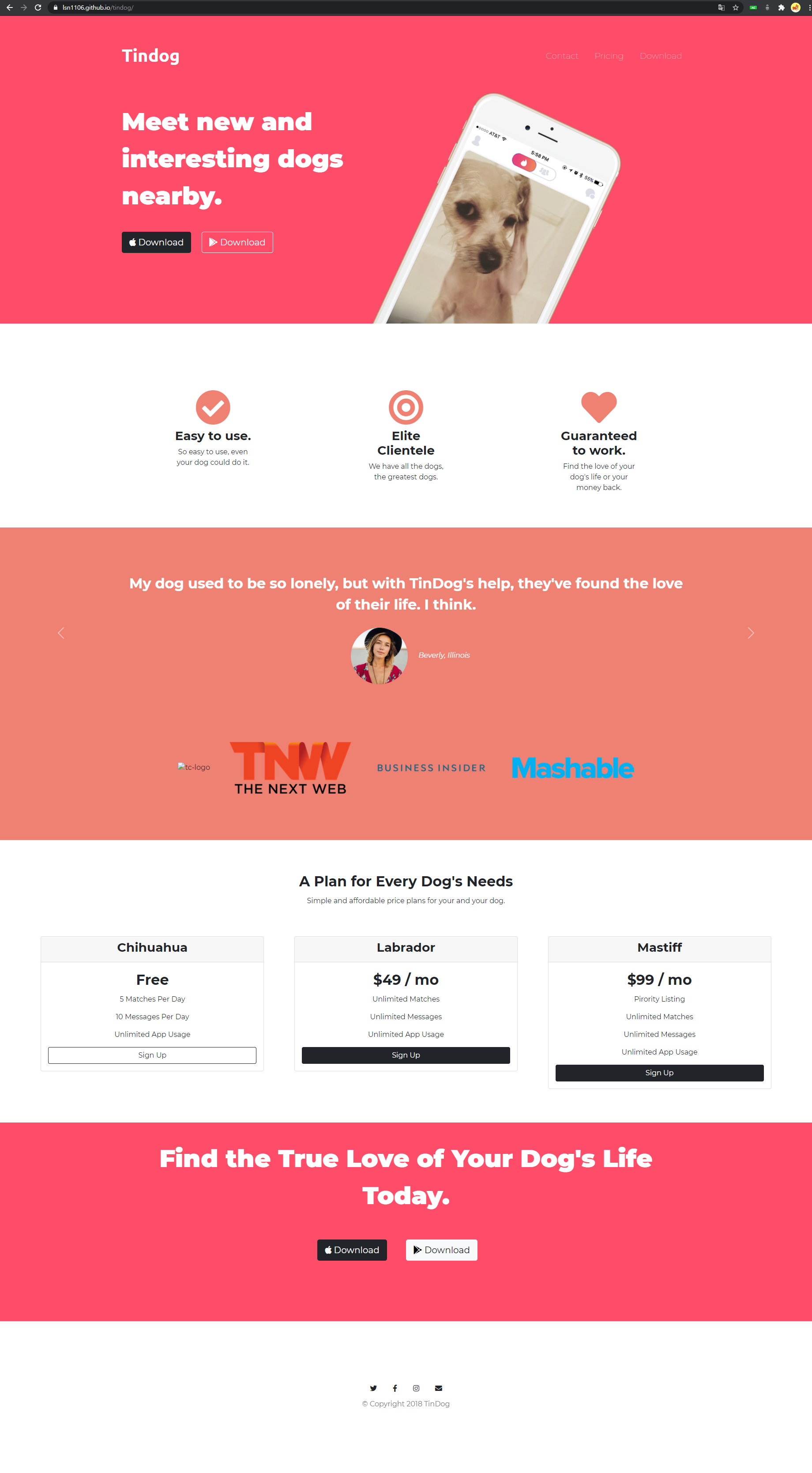
<Title Section>
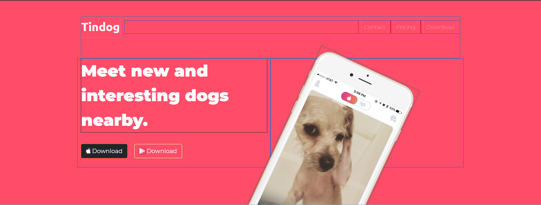
bootstrap의 navbar 참조.
ml-auto : 브랜드명은 좌측, 나머지는 우측으로 미룸
row, col : 부트스트랩 식 그리드. 화면크기를 lg, md, sm로 구분하고 12분할함. col-lg-2이면 큰 화면에서 한 줄에 6개 들어가는 식.
nav bar의 Contact, Pricing, Download 클릭하면 해당 위치로 스크롤 이동 -> a태그 href를 해당섹션의 #sectionid로
사진 기울이고 자른 방법?
transform: rotate(25deg);
position: absolute;
z-index 우선순위로 밑(Feature section)으로 덮어버림. -- 기본 설정된 z-index 우선순위로 충분해서 따로 설정하진 않음.
아이콘? fontawsome
버튼? bootstrap
media query
화면이 어느정도 작아지면(ex. 핸드폰) 강아지 사진이 밑으로 내려와서 정렬되도록 css에서 media query를 사용함.

@media (max-width:1028px){
	#title{
		text-align: center;
	}
	.title-image{
		width:70%;
		position: static;
		transform: rotate(0);
	}
}
<Feature Section>
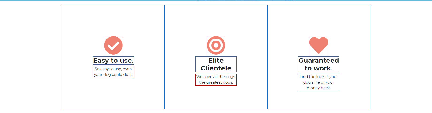
css의 pseudo-class로 마우스 올리면 색변하도록 함.
<Testimonial, Press Section>
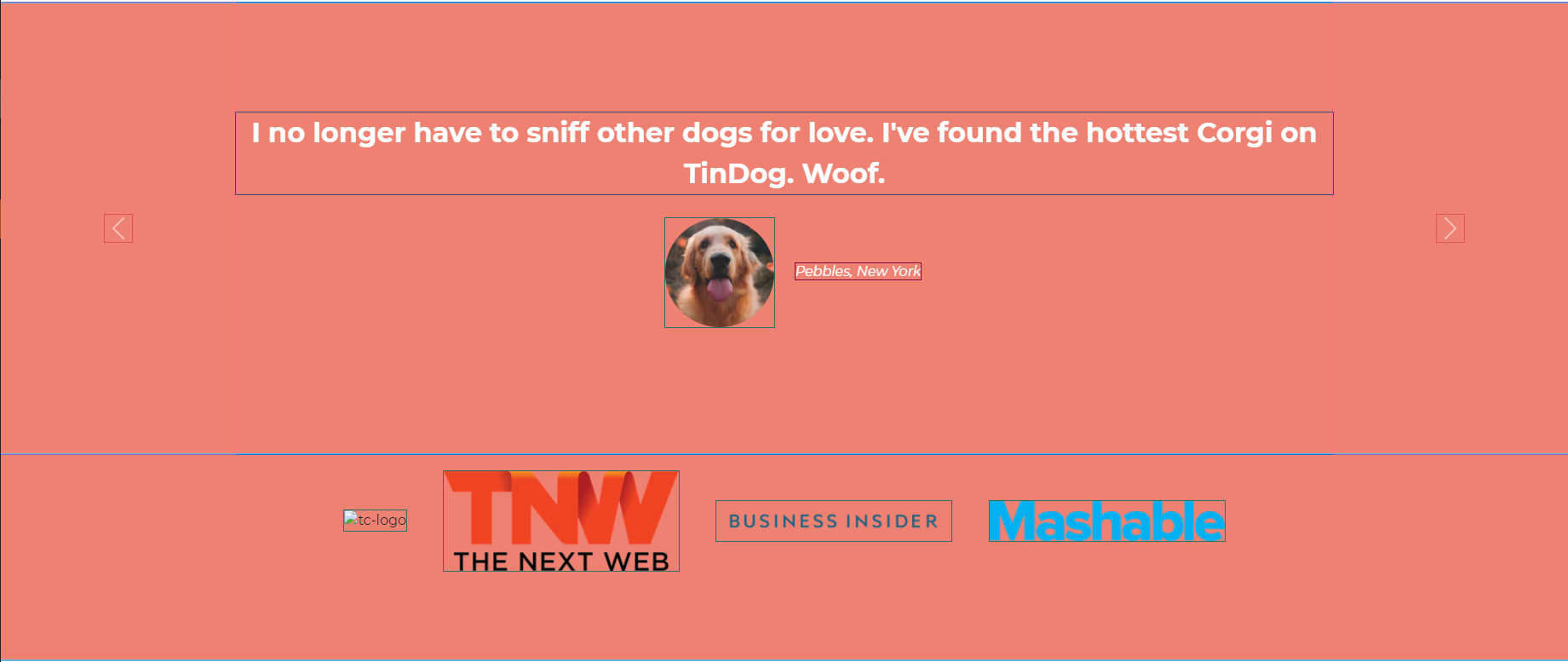
bootstrap의 carousel참조. 회전목마라는 뜻.
<Pricing Section>

bootstrap card와 grid 조합.
버튼도 bootstrap
<Call to Action, Footer Section>

아이콘? fontawesome
버튼? bootstrap
'웹 > 책 & 강의' 카테고리의 다른 글
| HTTP 완벽가이드 - 7장 (캐시) (0) | 2022.01.09 |
|---|---|
| HTTP 완벽가이드 - 6장 (프락시) (0) | 2022.01.09 |
| HTTP 완벽가이드 - 5장 (웹 서버) (0) | 2022.01.09 |
| HTTP 완벽가이드 - 4장 (커넥션 관리) (0) | 2022.01.09 |
| HTTP 완벽 가이드 - 1,2,3장 (HTTP 개관, HTTP 메시지) (0) | 2022.01.09 |


